Introduction
Hello 😄! My name is Vivi, an UI/UX Bootcamp student in www.dibimbing.id. This is my assignment for day 7 about UX research.
Overview
Netflix, Inc. is an American over-the-top content platform and production company. The company’s primary business is a subscription-based streaming service offering online streaming from a library of films and television series, including those produced in-house. Since the pandemic and people can’t watch movies in cinema, the number of users of Netflix has risen. So I chose the mobile app of Netflix Indonesia as a study case for UX research assignment. This research aims to identify any usability problems in Netflix’s features and improve them. Wish users could have better experience in the future.
Role: UX Researcher
Scope: User Research, analyzing, user flow, user persona.customer journey map. in-depth interview, and usability testing.
Timeline: 3 weeks
Tools: Netflix mobile app, Google sheets, voice recorder for the interview, and a screen recorder for usability testing.
The Process
In making products, I need a framework to make best products that can solve user's problems. In this study case, I use a design thinking framework (empathy, define, ideation, prototype, and test). Before making products, I have to empathize with the users, to have their insight and interaction toward the Netflix app. So I can know what the users need and what are some problems they are facing while using the Netflix app.
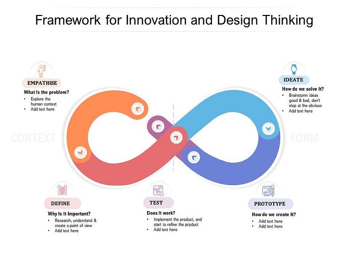
Empathize
At this stage, we will do 3 main things; Planning the Research; Making Research guidelines, and Conducting the Research.
Background
The digital world and the advances of technology change how people watch movies. Start from going to the cinemas, buying DVDs, and now movies in our hands. The media platform helps people to enjoy movies wherever they go. By streaming or downloading the watch later. Netflix is one of the platforms along with the competitors in Indonesia such as Viu, WeTV, Iflix, Vidio, Disney+ Hotstar, etc. Netflix as the biggest online movies application in Indonesia has a great opportunity to increase the number of users during the pandemic. However, I need to know in advance the user’s perception of the mobile application and the problems encountered. Therefore, I am interested in researching the user experience as a case study.
Existing App
Netflix mobile app only can be operated by 1 account for 1 smartphone. The convenience offered by Netflix mobile app is users can subscribe to multiple package options. Plus, users have the freedom to change their plans or cancel online at any time if they decide Netflix isn’t for them. Netflix provides a large selection of domestic and foreign films according to the user’s area.

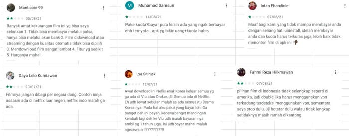
Netflix has been downloaded by more than one million users, received a rating of 4.3 (Google play store). Based on several lowest ratings (1–2 stars) given by users, this application has some problems including:
- Movie quality for streaming and automatic download in HD and there are no other options, so the user’s complaint about their data usage is drained a lot.
- The films shown are different in each country and the list of films is not complete
Here are some reviews on the google play store:
Planning the Research
Objective
The objectives are to find out or explore the motivation/habit/pain points/barriers when using Netflix mobile App. I try to dive into the problem and find out the root cause. This is my research objective:
“Understanding user’s thought about Netflix Mobile App”
Methodology
In this research, I used a qualitative methodology (In-Depth Interview) and Usability Testing
Sample Specification
1. Netflix Mobile App’s users who subscribed.
2. Netflix Mobile App’s who last watched movies in the app (maximum of three months ago)
3. Female/male
4. 18–34 years old
5. Live in Jakarta (Regional)
Key Information Areas
Key information areas are some of the main subjects that we want to explore in this research. These key information areas will be used as material to be processed in making a list of questions:
1. User Profile
2. General behavior when watching movies
3. General behavior when watching movies through the Netflix mobile app
Research Guideline
After compiling the research plan, I made a research guideline for conducting In-Depth Interviews (IDI). This guide contains introductions, explanations for users regarding the interviews to be conducted, a list of questions based on key information areas and closings.
Conducting the Research
At this stage, I explore information about the user’s thoughts in using the Netflix mobile app. The IDI and UT were carried by meeting with the five specific users in cafes.

Define
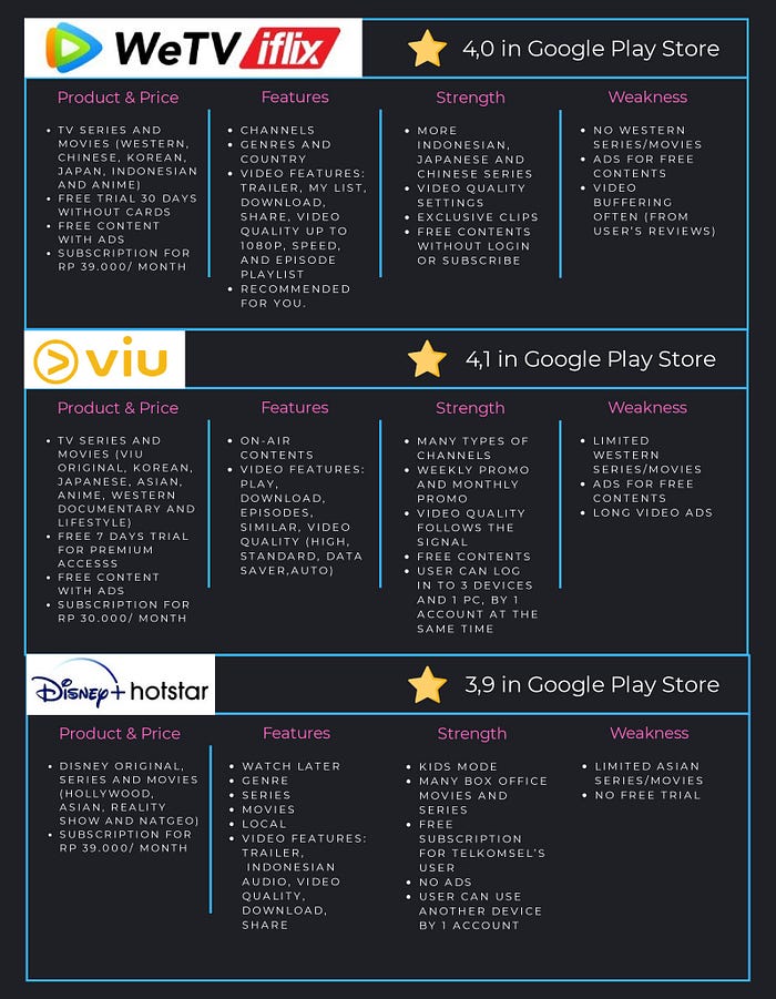
Competitive Analysis
Competitive analysis is useful to understand market trends, identify competitors and evaluate opportunities. Competitive analysis in this research was carried out on 3similar applications mentioned by users: WeTV Iflix, Viu, and Disney+ Hotstar.
Affinity Diagram
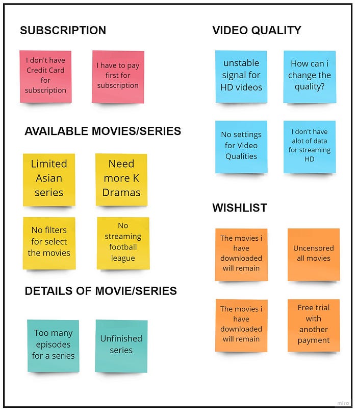
After doing the IDI, the insights obtained from these results are represented using an affinity diagram. An affinity diagram helps us to unify amounts of insights by finding relationships between them. The problems are grouped in the following affinity diagram below:
User Persona
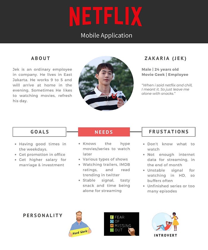
A user persona is a semi-fictional character based on Netflix’s current (or ideal) customer. This example of user persona I created, coming from conversations with users and segmenting by various demographic and psychographic data. User personas help us to focus on identifying and solving problems experienced by users.
Customer Journey Map
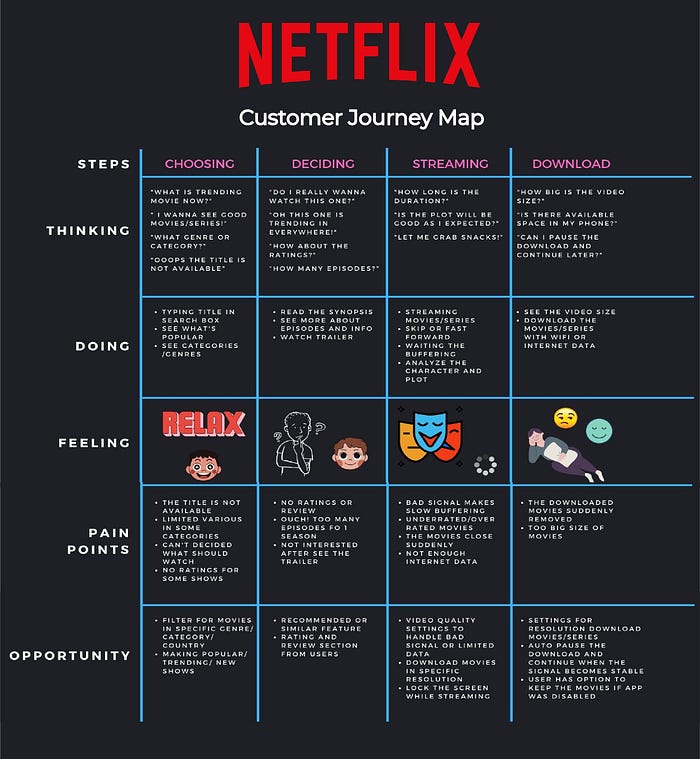
A customer journey map is a diagram that depicts the stages customers go through when interacting with the product. A great customer journey map must represent the experience in the user’s journey, not the way UX designers think. We can reveal more details such as the user’s emotional transformation, pain points, and UX opportunities. Based on the results of the analysis, the user has many pain points in the process of choosing the show to watch until streaming or downloading the show.
Problems
Based on the results of the analysis using affinity diagrams and customer journey maps, it was found three main problems faced by users:
1. Limited movies/series in some categories
“I love watching live football match and K Dramas, but these are not available in Netflix anyway…”
Users have their favorite show. Some of them love Hollywood, K Dramas, documentaries, and even football matches. But due to the license of TV shows and movies, Netflix can’t provide everything. This is a technical reason. On the other hand, Netflix limits access based on regions globally. As it is written in https://help.netflix.com/en/node/4976, users must use VPN to watch the show that is only available in a specific country. Therefore, this is a technical problem.
2. No ratings or reviews for movies/ series
“Can’t decide what to watch, how can I know the movie is good?”
In Netflix mobile App, there is no ratings or review from users. The only appear is how many percentage people like the show, and not every show has it. Some people will search ratings from other websites such as IMDB or rotten tomatoes. So it will be good if there are ratings and comment sections as user's feedback, better than the only percentage.
3. Users can’t choose the resolution for video quality
“How can i change the video quality on Netflix?”
Most users don’t know how to change the resolution of video quality. It is worst when the signal is bad or when the user has limited internet data. The streaming often buffers and becomes slow for downloading movies. Users can change the video quality from their web browser. There are auto, low, medium and high options for quality. Unfortunately, users can’t change the video quality via mobile app. It is important to make the video quality options when users watch streaming and before they start downloading the show.
Limitation
- The design of the mockup and prototype is limited to the activities of choosing shows based on categories and genres, streaming and download shows.
- The UT process is carried out on activities to choose the show that users want to watch, use rating feature and change the video quality for streaming or downloading.
Ideate
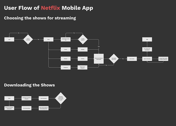
User Flow
User flow is diagrams that display the complete path a user takes when using a product. The user flow lays out the user’s movement through the product, mapping out each step the user takes — from the entry point right through to the final interaction. The following is the user flow of the activities choosing shows, streaming the shows, and downloading the shows on Netflix App:
